

Case Study. Governed data lake, dashboards and an AI analyst
A governed data lake, live dashboards and an AI analyst.
A multi-site healthcare network had dozens of reports run by hand, a KPI workbook everyone trusted and nobody could reproduce, and two systems describing the same customers with no key in common. We built the lake, reconciled it to their own numbers week by week, and put dashboards and an analyst on top.
- Zero extraction errors
- Reconciled to about 1%
- Your own data first to first demo
- Security and governance built in
The situation
Everyone trusted the workbook. Nobody could reproduce it.
The client is a multi-site healthcare network running two core systems plus three retail locations. Leadership met weekly against a KPI workbook that one person maintained by hand, downstream of dozens of scripts that were run manually before every meeting.
Nothing was wrong with the numbers. The problem was that no one could re-derive them, nobody could ask a question that was not already in the workbook, and the two systems describing the same customers shared no common identifier, so the most valuable question in the business could not be answered at all.
We are not naming the client. Everything below is aggregate and verified.
What we built
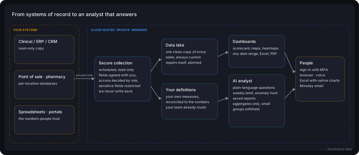
Four layers, and two security boundaries.
We read from your systems on a schedule and never write back to them. What comes across is agreed with you up front, and who can see it is decided by role.
How it ran
Three phases from first access to a live demo.
Phase 1. Access
Read-only access over a private connection, agreement on exactly which fields were in scope, and the first refreshes running. Not one extraction error.
Phase 2. Their definitions
The client's own measures rebuilt and reconciled against their workbook week by week, 45 weeks of history, before anyone was shown a dashboard.
Phase 3. Dashboards and analyst
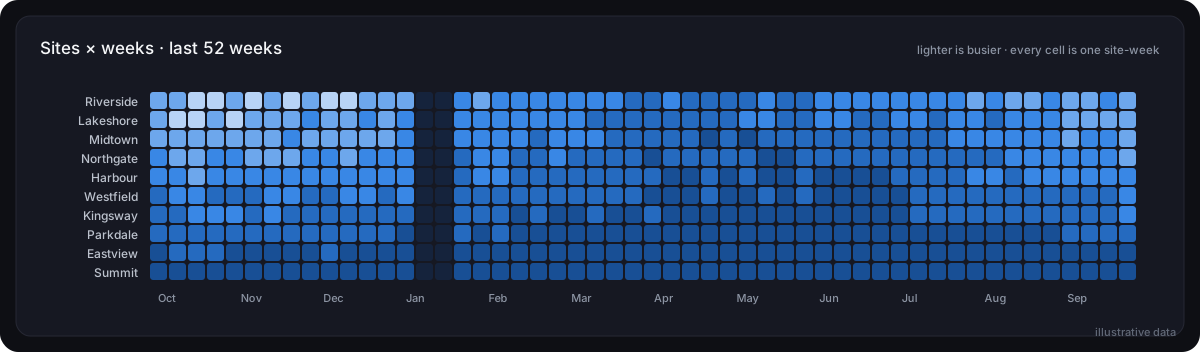
The scorecard live, plus heatmaps, catchment maps and forecasts, and the analyst held to the approved views and the aggregation rules.
The audit
Before the client's own team demonstrated it, every headline number was re-derived independently from the raw data. Ten of ten matched exactly.
Results
Measured, not estimated.
Coverage
Every system of record
Clinical, billing and point of sale brought into one governed lake and reconciled together, refreshed nightly with zero extraction errors. Integrating separate systems is the hard part, not the size of any one of them.
Accuracy
1%
average variance against the client's own weekly KPI workbook across 45 weeks, with the residual explained by late-posted bills.
Independent audit
10 of 10
headline numbers re-derived independently, straight from the raw data. All ten matched exactly.
Forecast error
7 to 18%
one week ahead on the main KPIs, stated on the chart. The 80% band contains the actual value 82% of the time.
Proof before commitment
Your own data first
from first database access to a live demo on the client's own real data.
The view nobody had seen
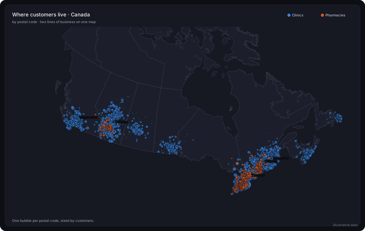
Where the patients actually live.
Catchment by location, two lines of business on one map, area names rather than codes. In the room, this was the slide that changed the conversation from reporting to planning.
The question nobody could answer
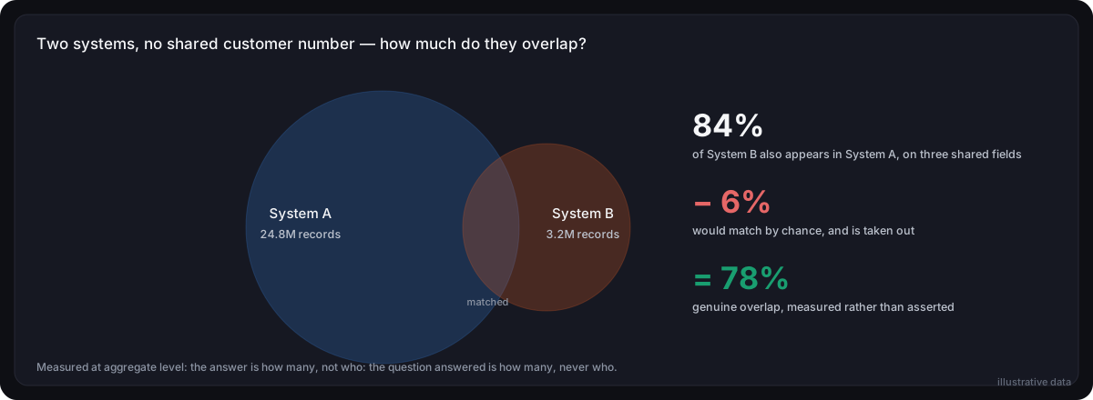
Two systems, no shared key.
The two core systems described the same people and had nothing in common to join them on. We measured how far they matched, took out the matches that were pure coincidence, and reported what was left.
It answers how many, never who. The result: roughly three quarters of one line of business were also customers of the other, a number the organization had never been able to state.
Security and governance
Controls set to your policy, not ours.
Cloud hosted and managed by us, with private connectivity to your source systems and MFA enforced before any page is served
Read-only access to the systems we read from. The platform never writes back to them
Role based access decides who sees what, so your teams get the depth they need internally while sensitive fields stay restricted
The analyst reads only the views you approve, never writes, and shows the query behind every answer, so any number can be traced back
Aggregation and suppression thresholds are configured to your own policy, including none at all where your teams need detail
A saved report is checked against the current rules every time it is opened, so it cannot outlive the policy it was written under
One more thing
Attributes they did not know they had.
The source system carried no standard field for a set of attributes the network cared about. Staff had been recording them in custom fields anyway, for years, for roughly half the customer base.
Nobody had been able to use them because nobody could get at them at scale. They are now on a dashboard.
See it on your own data
The same four layers work on claims, ERP, CRM, point of sale, subscription platforms and spreadsheets. Tell us which systems hold your numbers and what leadership asks for every week.